During my years as a consultant at the Boston Consulting Group, I learned that the difference between getting to the right results and actually getting someone to act on or listen to those results often comes down to how effectively you communicate your ideas. While raw analytical horsepower is crucial, the ability to craft compelling presentations that drive action is what truly sets apart top-tier consultants. Today, I'll share the approach I learned at BCG to creating powerful presentations that get results.
Why are great slides important?
Management consultants are often made fun of as “slide monkeys” or MBAs who spout out fluffy answers on pretty slides with no real experience. While there may be some fire where there is smoke, then the slide element is actually one of the main differentiators and a crucial reason why McKinsey and BCG consultants keep having a seat at the top tables of Fortune 500 companies.
It can seem trivial - why should the same basic message in a wall-of-text slide be interpreted any differently if it’s set up graphically? It’s the same content that is presented.
But remember, information is as much form as it is content. To convey information effectively, you need both elements to work together. The exact combination will differ greatly depending on subject, audience, situation etc. but the two must always be in lock-step.
A wall-of-text slide or bad formatted slides distract from the main point(s) you want to get across. Lack of things like action titles and directing the audience with colors, graphics, and takeaway boxes means you place a higher burden of extracting meaning on your audience. This is the opposite of what you want to achieve. Typically, you want the stakeholder listening or reading your presentation to spend their thinking time deciding on whatever question you want them to answer. You cannot expect your audience to have time to read through and decipher vague presentations.
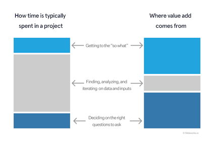
To summarize, most business professionals will spend the majority of their time collecting and analyzing information, but their audience is primarily interested in the "so what" - the implications and actions that should result from that analysis.
This leads to a bit of a paradox. While you might spend weeks or months doing rigorous analysis, your ability to drive change often comes down to a 30-minute presentation. In that brief window, you need to build credibility, convey complex insights, and motivate action.
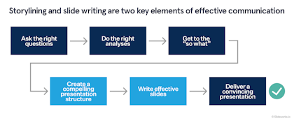
This is where great slides become critical, and why storylining (the act of structuring your overall slide deck’s flow) and slide writing (the act of creating impactful, individual slides) is such a central part of the McKinsey and BCG learning journeys.
If you hear someone scuff at spending time on slides, it’s often because they don’t understand the power of great slides. Think about it this way: you could have breakthrough insights that could transform a business, but if you can't communicate them effectively, those insights will never be implemented. Great slides aren't just about aesthetics - they're about turning insights into action.
What are the components of a great presentation?
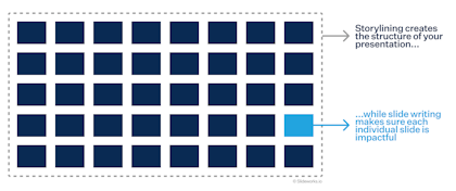
Aside from asking the right questions and doing solid analysis, there are two fundamental parts of creating great presentations: storylining and slide writing. These components work together like architecture and interior design - while each has its own principles and purposes, their interaction determines the overall impact of the final product.
Storylining: The architecture of your message
Storylining is the invisible framework that gives a presentation its power. Much like a building's architecture, good storylining creates a structure that may go unnoticed by the casual observer but is immediately felt in its impact. It's what separates a random collection of insights from a compelling narrative that drives action.
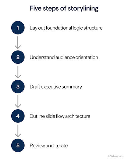
At BCG, we were taught that there were five steps for effective storylining:
- The first step is laying out the foundational logic structure, typically built using the Pyramid Principle. This approach ensures that the overall question that the presentation seeks to answer or the main decision that is needed to be made is put at the forefront. It also ensures that stakeholders/audience are dispositioned to interpret any information in the presentation with that main question/decision in mind, thereby limiting irrelevant questions and lost focus.
- The second step is audience orientation - the careful calibration of content and approach based on who's receiving the message. I've seen many presentations fall flat not because their content was wrong, but because they didn't account for their audience's perspective, knowledge level, and decision-making style.
- In the third step, you create a draft of the executive summary. This acts as the presentation’s backbone and allows you to quickly get a feel for which sections should be included in the presentation.
- The fourth step is outlining the slide flow architecture using action titles and rough sketches. This is where the overall story gets broken down into discrete chunks that can be absorbed and understood piece by piece.
- Finally, the fifth step is reviewing and iterating - the systematic approach to testing and refining the story's coherence, completeness, and impact. This ensures that the final presentation achieves its intended effect.
Slide writing: The art of visual communication
While storylining provides the framework, slide writing is where the rubber meets the road. It's the tangible expression of your story through visual and written elements. In my years at BCG, I saw how mastery of slide writing could transform even the most complex analyses into clear, compelling points.
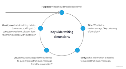
The art of slide writing encompasses five key dimensions:
- Purpose is key and the first dimension. Every slide in a BCG deck serves a specific function in the overall storyline and main objective of the presentation. Understanding the purpose of the slide - whether it be communicating data, facilitating a process, or putting key points in a wider context - helps lay out the bones of the slide design and what that single slide should ultimately achieve.
- Title architecture comes next. Slide titles are not just labels, but rather complete thoughts that drive home key messages. When done right, you should be able to read just the titles of a presentation and understand the core argument.
- Slide body is the third dimension and where the actual content lives. This encompasses everything from chart selection to data presentation to text layout. It's where the principles of visual communication come into play, determining how information is organized and presented on each individual slide.
- Visual emphasis is the fourth dimension. This includes all the techniques used to guide the audience’s eye and highlight key information - from color usage to placement to white space. It's what makes complex information digestible and ensures key messages don't get lost.
- Quality control rounds out the system. These are the systematic approaches used to ensure each slide meets BCG's high standards for clarity, accuracy, and impact.
How to write great slides
Let's dive deeper into the practical application of these principles. Here's how to put these concepts into action:
Storylining in practice
1. Start with the big picture:
- Begin by clearly defining your end goal / what you wish to achieve with this presentation - is it a decision, concrete action items, agreement on a process or something else?
- Map out the key questions you need to answer and points you want to cover. Don’t worry about granularity at this stage.
- Group similar or related points in larger sections
- Use the Pyramid Principle to determine the “so what” / main point of the presentation and map out how your groups support that argument.
2. Choose your overall approach based on your audience:
- For senior audiences: Use a top-down approach, leading with conclusions
- For technical audiences: Use a bottom-up approach, building your case methodically
- For mixed audiences: Consider a hybrid approach with clear signposting
3. Draft your executive summary:
- Draft a first-best-guess version of your executive summary based on the top-down or bottom-up approach you decided in step 2 and the groups of data and takeaways you found in step 1.
- Don’t worry about making it perfect now - this is simply to help you draft the skeleton of your presentation and pressure-test if your storyline works.
4. Build your narrative:
- Start fleshing out sections based on your draft executive summary.
- Create rough sketches of your slides in PowerPoint or on paper with action titles and potentially the content you want to include on the slide.
- Ensure each point / slide flows logically to the next.
- Create clear transitions between sections.
- Your action titles will be re-iterated when you start digging into each individual slide, so don't worry too much about getting it 100% right on the first round.
5. Test your logic and iterate
- Read just the slide titles - they should tell your story.
- Check that supporting points truly support your main message.
- Verify that your conclusion follows naturally from your argument.
- Keep repeating this step as you build your slides individually.
Slide writing in practice
1. Force yourself to articulate the purpose of your slide:
- Ask yourself why this particular slide should be in your deck and what purpose it serves.
- Typical purposes are:
- Guiding your audience through a frameworks, process, or timeline
- Communicating data and insights
- Facilitating and inspiring discussions and decisions
- Play devil’s advocate and remove the slide. If the overall story still feels cohesive then take the slide out of the deck completely. You can always include it in an appendix later, but the more concise and spot on you can make your presentation, the better.
2. Give a first-best-guess on an action title for your slide:
- Write down what you would say as the main message when presenting your slide.
- Link the title to the slides before and after to create a cohesive story.
- Edit the title to make it more concise and precise, e.g., by removing excess words and unnecessary adjectives.
- Once you’ve finished the slide, go back and test that your action title still matches the body of the slide and any claim is supported by data on the slide.
3. Select the right format for the body of the slide and fill it with relevant content
- The purpose of the slide should guide the format of content you put on the slide:
- Use charts and supplemental bullet points for relationships and trends
- Use tables for detailed comparisons
- Use brief text for conceptual explanations
- Use graphics like process bars, timelines, or figures to guide audiences through a structure and process
- Fill in data and other content that supports your main message.
- If you’re struggling to decide what data to include or have several e.g., graphs that show slightly different things with different important takeaways, consider splitting it into two slides with two separate action titles.
4. Apply visual best practices to help guide your audience
- Eliminate chart junk (unnecessary lines, decorative elements).
- Use color strategically to highlight key points.
- Maintain consistent formatting throughout.
- Ensure all text is readable from the back of a room.
- Remember to include wide margins and white space to help your audience digest the slide.
5. Quality check all details and optimize the content
- Double-check all details:
- Are footnotes and sources included and correct?
- Are there any spelling mistakes or grammatical errors?
- Are fonts in line with your slide master?
- Are text sizes congruent across the slide (best practice is two text sizes on the main body of the slide, ideally two points apart e.g., size 16 for headlines and size 14 for main text)?
- Are colors correct?
- Are figures and text boxes aligned?
- Include only essential information - try to cut as much as possible.
- Use appendices for supporting detail.
- Ensure every element serves a purpose.
- Apply the "squint test" - key messages should be clear even when squinting.
Applying these practical steps will feel cumbersome in the beginning but quickly starts to become second nature and has cascading benefits for your presentation skills.
Conclusion: The path to presentation excellence
Creating truly great slides is both an art and a science. While the principles I've shared from BCG provide a robust framework, true mastery comes from practice and iteration. The key is to remember that slides are not an end in themselves - they are a tool for driving understanding and action.
The most important lesson I learned at BCG was this: great slides aren't about showing how smart you are; they're about making your audience smarter. When you focus on clarity, impact, and audience understanding, you'll create presentations that don't just inform - they transform.
For those looking to improve their presentation skills, I recommend starting with one aspect at a time. Perhaps focus first on crafting better titles, then move on to chart selection, then story structure. Like any skill, this is one that improves with deliberate practice and feedback. And of course, build up your personal slide library of great slides that you can go back and use again and again. Or buy one of our templates here to get a head start.
Remember, the goal isn't perfection - it's impact. Even a few small improvements in how you structure and present your ideas can dramatically increase your effectiveness in driving change and getting results.