


Consulting Toolbox
How Consulting Decks Differ from AI-Generated Decks (and How to Use AI Well)
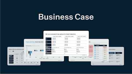
In this article, we show seven ways AI-generated decks fall short of consulting-grade decks from McKinsey, BCG, and Bain. Then we go over how we use AI tools to keep the thinking but delegate the grunt work.
Jul 1, 2026