General

How McKinsey Consultants Make PowerPoint Presentations

Updated: Aug 29, 2023
How McKinsey Consultants Make PowerPoint Presentations

This article covers the structure of a McKinsey presentation, its key elements, and formatting tips and tricks. The principles are nearly identical to those found at BCG, Bain, or other top consultancies, although there are differences in terms of design and style.

As a note, the type of presentations we are covering in this post are what you would call ‘corporate’ or ‘management consulting’ presentations. These types of presentations are typically longer, data-heavy slide decks that serve as the foundation for complex decisions and recommendations. We are not referring to decks for keynotes, college projects, or design presentations.

The structure of a McKinsey presentation

A complete consulting presentation typically contains the following five overall sections: 

  1. Frontpage
  2. Executive summary 
  3. Body of slides
  4. Recommendation / Next steps
  5. Appendix

Let's dive into each section one by one.

Section 1: Frontpage

The front page consists of a few simple elements: a title, a sub-headline, name of company, date and time. The title is usually less than 8 words long. A sub-headline is an optional second description line, used for further elaboration.

In consulting the 'name of company' and the template theme typically depends on whether the client wants to position the work as internal or external. If the client wants to position the work as external, then the front page will have McKinsey’s name and use its signature design template and color scheme. Vice versa, if positioned as internal work, the slides will be branded with the client organization's logo and design.

Section 2: Executive summary

The executive summary, sometimes called 'At A Glance', is the presentation's first slide and usually the single slide that takes the most time to write and perfect. 

The executive summary summarizes the key arguments, storyline, and supporting evidence of the body slides. This helps the reader get a quick overview of the presentation and take away the most important insights and recommendations.

Executive summaries written by McKinsey, Bain, and BCG usually follow the Situation-Complication-Resolution (SCR) Framework, which is a straightforward and effective approach to communicating the complete storyline of your slide deck.

See our post on How to Write an Effective Executive Summary for tips and tricks.

Section 3: Body of slides

This is the central section of the presentation. This section often contains 50+ slides filled with quantitative and qualitative content. To avoid 'death-by-powerpoint', it is crucial to structure both the overall storyline and individual slides in a clear and engaging way. 

Let’s start by taking a look at the way McKinsey consultants create individual slides.

The anatomy of a slide 

At its most basic form, each slide must consist of 3 main parts:

(a) Action title - a sentence that articulates the key implication or insight   
(b) Subheadings - what data are you using to prove the insight?  
(c) Slide body - the actual data used to prove the insight (text, numbers, visuals, footer).

As a rule of thumb, there should be nothing in the action title that's not in the slide body, and nothing in the slide body that is irrelevant to the action title.

a) Action title

When you become a management consultant, one of the first things you are taught is that the title of a slide should always be an 'action title' that articulates the key takeaway or 'so-what' of the slide.

Often presentations are read by busy executives. Action titles make your slides easier to understand because your reader doesn't have to dive into the detail of the slide body to understand the key takeaway of that slide.

As an example, imagine you are creating a slide showing yearly development in revenue and costs for a business unit.

A passive title for that slide could be: 
"Historical development in Revenue and Costs". 
As a reader, you need to study the chart to deduct the 'so-what' of the slide.

An action title would be: 
"Over the last 5 years, costs have grown 10% per year, which is double revenue growth"
As a reader, you immediately understand the message of the slide. You can now choose to look at the data on the slide more closely, if you want the details.

See our blog post on Action Titles for a more comprehensive guide.

(b) Subheadings

Subheadings are meant to give a clear summary of the data used to prove the insight in the action title, or alternatively add some nuance to the main takeaway. Keep it crisp and short.

Here are a few examples:

  • Sales of personal luxury goods, US Market, $ billions
  • Forecasted evolution of battery cell costs by 2030 ($/kWh)

(c) Slide body

A clear and concise slide body is essential for effectively communicating insights to an audience. The slide's main insight, articulated in the action title, should be supported by all relevant information presented in the simplest possible way. 
You have likely done a lot of research, and it is tempting to include all the interesting data you have found. Avoid this. Instead, try and remove all facts and figures not directly supporting your key insight stated in the title.  

Here is an example: 

Slide body

In this case, the title is clear, and the content of the slide only serves to prove and support the slide's main insight.  

When building your slide, you may only sometimes start with the title and then fill in the data to support it. Often it is more of an iterative process where you try out different titles to capture the data you have collected and the flow of the overall storyline.

Now that we have covered the building blocks of individual slides, let’s move on to how McKinsey, BCG, and Bain consultants construct a storyline.

Horizontal flow: The structure of a storyline

‘Storyline’ refers to the way the slide deck is built up or in other words the ‘flow’ of slides. The exact storyline created by McKinsey, Bain, and BCG consultants is typically tailored to that specific use case. But in general consulting storylines follow an SCR (situation-complication-resolution) framework.

The SCR framework is a way of structuring your findings in a clear and concise way that is engaging and intuitive. Here is what each part of the framework means:

  • Situation: The situation is the starting point or context of the problem or issue you're addressing. It might include information about the current state of affairs, the background of the problem, or any other relevant details that help set the stage. The situation can also focus more narrowly on a specific opportunity or threat.
     
  • Complication: The complication is the specific challenge or problem that has arisen within the situation. It might be a roadblock, an unexpected development, or a major hurdle that needs to be overcome. It can also refer to gaps in capabilities needed to capture an opportunity.
     
  • Resolution: The resolution is the proposed solution to the complication or problem. It should be a clear and actionable plan for moving forward and overcoming the challenge. This might involve specific steps to be taken, resources needed, or other details that help ensure success. We cover this in more detail in the next section.

Your storyline should be clear at the slide title level, which is why action titles are so important. Your audience should be able to read only your action titles all the way through the presentation and a) understand what the main conclusions are and b) understand how you got to those main conclusions through analysis. In other words, your action titles should flow like a story and be readable on their own.

In practice, when starting a new deck it can be helpful to sketch out your overarching sections on paper. Then follow them up with empty slides using just action titles (or fill in the slides with rough notes on which analysis or sub-conclusion goes on that slide). Print out your slides and lay them on a table or put your slides in ‘Slide Sorter’ mode in PowerPoint and see if the flow of slides makes sense.

You can also choose to write your entire storyline in a word document focusing first on the action titles of each slide and then supplementing the action titles with underlying bullets describing the data or information that will go on the slide to support that action title.

McKinsey consultants have a library of old cases to use, which helps create a skeleton or inspire a new deck and allows them to make better presentations in much less time. Build your own library by saving excellent presentations you come across in grouped categories and creating an ongoing general PowerPoint where you collect good slides to reuse.

Take a look at our templates to find specific storylines to match your needs, complete with multiple real client examples.

Section 4: Conclusion/recommendation

A crucial part of any consulting presentation is the conclusion/recommendation section. These slides outline the actions or responses required to address the situation and complication you've covered earlier in your slide deck. They often also include a suggested implementation plan and immediate next steps.

While there is generally flexibility in how you lay out your conclusion/recommendation slides, the following three guidelines will help you create effective recommendations that are easy to understand and follow:

  • Groups: Group your recommendations into categories to make your reader's understanding easier.
     
  • Labeling: Label or number your groups and/or individual recommendations to help your reader follow the structure when you discuss your recommendations across multiple slides.
     
  • Active voice: Write your recommendations in active voice starting with 'action words' (verbs), such as "Grow...", "Minimize…", "Improve…", "Increase…", "Target…", "Increase…", etc.

Here are a few examples of recommendation slides from McKinsey, BCG, and Bain:

BCG recommendation slide example
BCG recommendation slide example #2
Bain recommendation slide example
McKinsey recommendation slide example

Section 5: Appendix

It is not uncommon for the appendix, also called backup pages, to be significantly longer than the main deck. The main deck tells the story, and the appendix contains details and all supporting evidence that might be relevant but is beyond the scope of the main storyline.

In other words, keep the storyline of the main deck as crisp and clear as possible and move all supporting documentation and details to the appendix. Here they will be out of the way but available for reference. 

Formatting tips

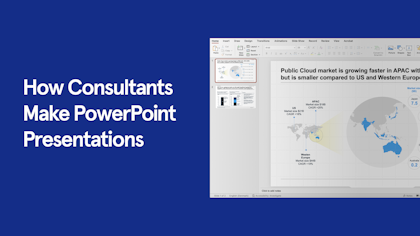
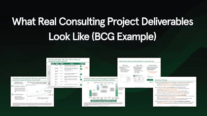
Presentations from top consulting firms like McKinsey, Bain, and BCG tend to feel very different and convincing compared to other corporate presentations. A part of this is the ability to effectively structure both individual slides and the full deck, which we have talked about in this post.
But another part is the rigorous training in slide design and formatting details that ensure the output is of the highest quality.

Below we have gathered some common formatting tips for designing compelling and consistent slides:

Color: Color matters. Keep the color pallet simple and use bright colors selectively to draw attention to key data or insights. Create a color hierarchy and apply it consistently across your deck.  

Fonts: Pick one (or two) font types and stick to it. BCG only uses the font 'Trebuchet MS'. McKinsey’s new 2020 template uses 'Arial' for slide body content and 'Georgia' for titles and select visual elements.

Margins: Never go outside of the slide margins. Use 'Powerpoint Guides' to clearly view margins when in design view.

Titles: All titles throughout the presentation should be two lines or less and use the same font size.

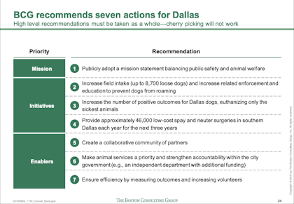
Lists: Only used numbered lists if the numbers themselves are relevant (e.g. if you are ranking items). In most cases, use bullets instead of numbers.

Icons: Icons are simple but can completely transform a boring text slide when used correctly. Replace bullets with icons that represent the bullet item if your slide is otherwise relatively simple. Ideally, use icons in places where the icons ‘have meaning’ and can be used later in the presentation when referring back to or going into detail around a certain topic.
Use icons in the same style and boldness. Buy access to a large premium icon set like Streamline Light or Streamline Regular if you can. https://www.streamlinehq.com/icons/streamline-light.

Align, align, align: Content on all slides should be aligned. Titles and subheadings should have the same exact position across all slides. When you flip through your slides, the position of the headline should not move, and the font size should not change. This also goes for other common repeated elements (logo, source, page number etc.), as well as similar items on a slide (column headers, graphs etc.) Using a well-designed master template is the easiest way to keep alignment accuracy.

Animations: Refrain from using fancy graphics and animations in the slides.

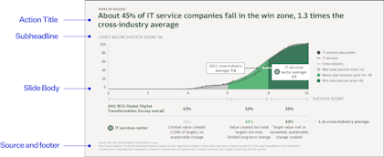
Slide number and source: Each slide should also have a slide number and a source in the bottom section that provides the source of the data used.

Text: Review the text on each slide to ensure that it is clear, concise, and well-structured. Eliminate unnecessary words and sentences. Keep it as simple and short as possible.

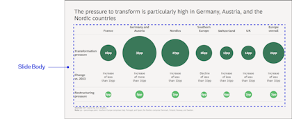
Visuals: Ensure that visuals in the form of graphs, charts, diagrams, tables, and images are high quality and add value. Add call-outs, highlights or similar wherever it makes sense to make the so-what of that visual more clear. Colors, fonts, and layout should be consistent with the rest of the presentation.