How to Write a Market Entry Report: The Structure McKinsey, BCG, and Bain Use
A market entry report compares geographies to support expansion decisions. Explore the structure McKinsey, BCG, and Bain use to build one.
Apr 8, 2026
Recommendation slides are often the most important part of any consulting project, yet are not often discussed. In this post, we’ll go over what a Recommendation slide is, how it is different from a Next Steps slide, how to create a best practice layout, as well as show you examples of what it looks like in McKinsey, BCG, and Bain projects.
A Recommendation slide is a slide that outlines the main suggestions or proposed actions based on the information presented in the preceding slides. It typically comes after the analysis section of a presentation and is the introduction to the solution/conclusion/roadmap section. The Recommendation slide may be a stand-alone slide just listing suggested initiatives, or it may be several slides that summarizes opportunities and expands them into concrete sub-initiatives.
The Recommendation slide is a part of the family of main message slides that also include the Executive Summary and the Key Takeaway slide.
The purpose of a Recommendation slide is to give a clear, concise, and easily understandable overview of initiatives that an organization or team can take to achieve some stated goals or change a situation identified through the analysis. In that sense, the recommendation slide is the “R” of the SCR or Situation-Complication-Resolution framework commonly used by management consultants to structure their presentations. This also means the Recommendation slide is in many ways the most important slide of the entire presentation or project, and presents the most valuable information.
It is important to remember that a Recommendation slide is meant to elicit action and form the basis of a plan going forward and a roadmap for change. It should be a guide that aids decision makers in allocating resources and formulating strategies going forward. In other words, the Recommendation slide ties together the analysis and the plan moving forward.
A good Recommendation slide should therefore directly address the issues or opportunities discussed in the presentation and be relevant to the goals and objectives of the audience/client. Furthermore, each recommendation should ideally be supported by data or analysis presented earlier in the presentation. This helps make the recommendations credible and persuasive. Finally, the recommendations should be action-oriented and be both practical and achievable.
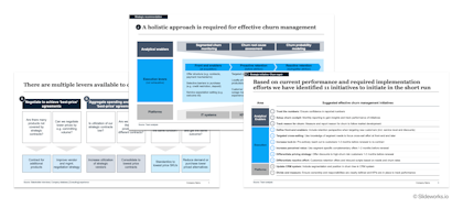
Some examples of Recommendations slides from our Slideworks templates
Recommendation slides are sometimes confused with Next Step slides, however the two types are quite different.
A Recommendation slide lays out the key actions needed to reach an established goal. These include both short and long term actions.
The recommendations are typically unfolded in a longer roadmap or implementation plan.
A Next Steps slide typically focuses on the immediate next steps that need to be taken to start putting the implementation plan/roadmap into action.
A good way to distinguish between the two is to think of them as answering two different types of questions:
Find ready-to-use PowerPoint slides for creating best-practice Recommendations in our Consulting Toolkit Template.
Recommendation slides come in many different formats, with a simple text slide being one of the most common forms.
However, even if it is a simple slide there are some basic best practices that help make your Recommendations slide clear and impactful:
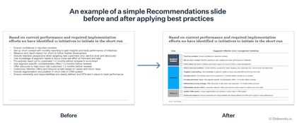
Below is an example of how a simple text slide of recommendations is made easier to understand and digest by following the simple steps above. The slide on the left is a simple bulletpoint text slide but it is difficult to see what type of recommendations are put forth and what each recommendation is. The slide on the right contains the same information but has been grouped in categories with bolded text summarizing the recommendation and added numbers to get an easy overview.
Below we bring you a series of examples from McKinsey, BCG, and Bain to show you how recommendation slides are presented in top-tier consulting houses.
The first example if a slide from McKinsey from this deck. Here you can see how they highlight key points in each recommendation with bolded text, as well as adding numbers to make the recommendations easier to grasp.
In addition, notice that the title is an action title and does not simply say "Recommendations".
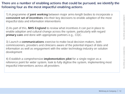
A simple recommendation slide from McKinsey & Co
Our second example is a similarly succinct and simple recommendation slide from BCG from this project.
Here, they have used simple boxes to group the recommendations into main categories that mirror the client's strategic priorities. By adding contrasting number balls to each recommendation they make it easy to get an overview and follow the recommendations in the rest of the deck.
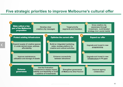
A simple recommendation slide from Boston Consulting Group
Below is also an example from BCG, from this classic deck. Here, they start off by recommending seven overarching areas of action to effectively communicate where the burning platforms are. They then expand on these areas with specific, granular initiatives to create the "to-do" list, and finally present a prioritization of initiatives to aid decision makers in where to start allocating resources.
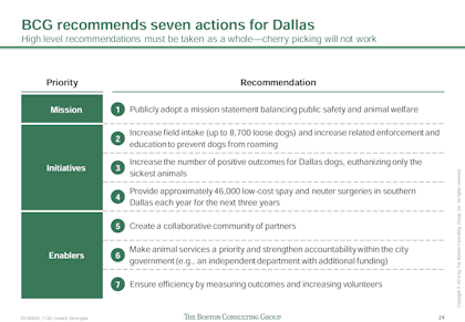
An example of a recommendation slide from Boston Consulting Group that starts with the overarching areas of action...
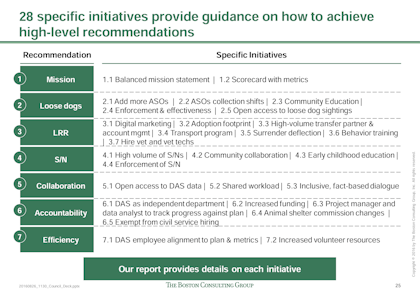
...that are then expanded into concrete initiatives...
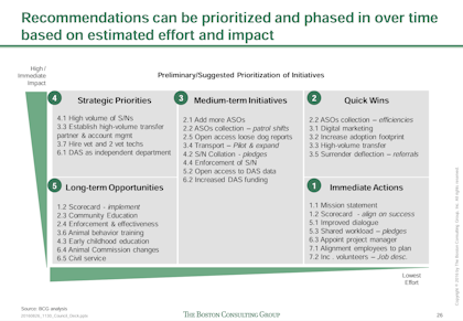
...and finally prioritized according to effort and impact
Another example from BCG comes from a report on the steel industry in Malaysia from 2012. Here you see how the recommendations are succinctly summarized, then a timeline for implementation is defined, and finally the recommendations are translated into immediate next steps:
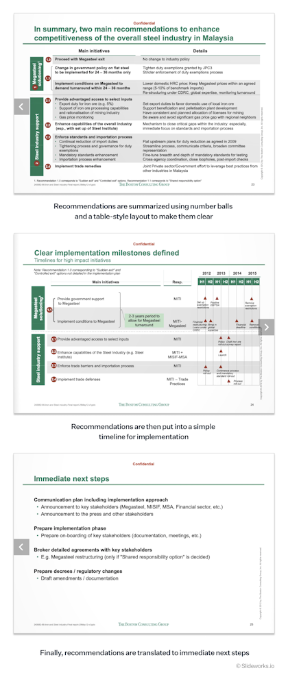
Finally, here is an example from Bain (find the full deck here). Similarly to the previous BCG example, they start off by summarizing the five opportunity areas they have identified through their analysis. This gives the client a clear idea of where the most impactful recommendations will be and helps frame the following initiatives.
Within each opportunity area, the Bain consultants then frame recommendations/initiatives by contrasting them to their key findings. This gives the client an assurance that the recommendations are data-driven and helps anchor each recommendation in a known context.
They end by summing up the expected results of implementing each recommendation to both help the client understand which areas bring the most savings and support the "case for change".
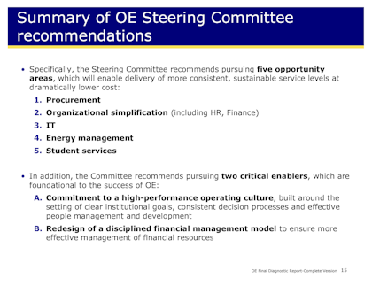
An example of a recommendation slide from Bain & Co that starts off with an overview of opportunity areas...
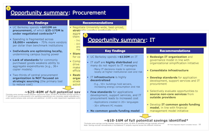
...before deep-diving into each area and listing specific recommendations...
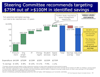
...and finally summing up the impact of these recommendations
These are just some examples of what recommendation slides can look like. If you need to create your own Recommendations slide, you can find ready-to-use, best-practice template slides in our Consulting Toolkit, along with many other useful slide layouts.
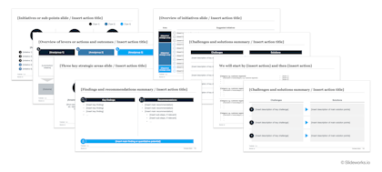
Find ready-to-use template slides in our Consulting Toolkit