How We Test AI Slide Tools: Our 10 Consulting Criteria

We score every AI slide tool and model on 10 criteria that describe a consulting-grade deck. A consulting-grade deck is one a McKinsey, BCG or Bain team would send to a client and is based on our experience at the those three consulting firms. The 10 criteria fall into three groups (the individual slide, the deck as a whole and the finish overall), and each is scored pass, partial or fail. Price, speed and exported file format are reported next to the score, along with a date for testing and model settings.

In this article, we explain why we have decided to use a fixed standard, what our 10 criteria are in more detail, what the method doesn’t cover, and examples of what we mean to make it concrete.


Why we use a fixed standard

With AI tools and models popping up and getting better week to week it can be difficult to get an overview of how good each new tool or model is, and especially to assess how well they function in a typical business or consulting workflow.

We’re interested in creating high-quality, consulting-level slides that ideally match the outputs from top-tier houses like McKinsey, BCG, and Bain. Therefore, we decided to set up a fixed standard and sets of tests to be able to objectively and consistently judge outputs of new models or specialized AI slide tools and thus compare them and ultimately recommend the best ones to use.

The standard is based on the training and techniques that were drilled into us during our years as consultants at Bain, BCG, and McKinsey. We’ve synthesized them here in 10 criteria that reflect both the little things that make a difference like consistent font sizes or well-formulated action titles, as well as the big things that make decks look and feel client-ready like clear messages, the right amount of information on slides, and compelling storylines.

Let’s dig in.


How we set up a test

A score only means something if every tool gets the same task. In our tests, we’ve narrowed it down to the following setup:

  1. The same brief: Each tool receives the same prompt with the same source material, when relevant. We purposefully try to test mostly finished research and reports to limit the effects of how well the different models conduct research and only focus on how they turn data into slides. 
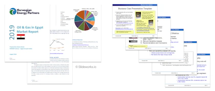
    Our standard source materials are a 52-page industry report Oil & Gas in Egypt: Market Report, a 28-page public industry report on the China Juice Market Report, and a made-up business case that we ask the tools to make better. Each test post describes the brief it used.
     
  2. The same slide master: When relevant for the test, we use our own Slideworks PowerPoint master, which represents a neutral, corporate master and color palette. Where a tool cannot take a master, we note it and score criterion 10 as a fail.
     
  3. The same starting point: We use the prompt as written, and typically follow the recommended options if a model or tool suggests something. We do not edit the output by hand before scoring.
     
  4. Recorded and dated: We note the tool, the model or version, the plan tier and the test date. Where possible, we publish an unedited screen recording of the run.
     
  5. Fixed criteria: We use the same 10 criteria to score each output. We take turns scoring output and often discuss it between us. When the call is close, we say so in the review.

As a rule of thumb, a test is only comparable with another test if the brief and the method version match. Each review states both in a method box near the top.

Pages from a 2019 oil and gas market report on Egypt and slides from a 2008 business case template, shown as examples of test source material.

Examples of the source material each tool receives. Left: Oil & Gas in Egypt Market Report, Norwegian Energy Partners (2019). Right: Business Case Presentation Template, Solution Matrix Ltd (2008).

The 10 criteria we use to score AI slide tools

We have set up 10 criteria that fall into three main sets; the first set judges each slide individually, the second set judge the deck as a whole, and the third set judges the overall output look and feel:

© Slideworks.io
# Criterion The question we ask
The slide 1 Layout fits the message Does the layout make the key message easy to see?
2 Only relevant data Does each slide manage to only keep information on it that’s relevant for the main message of the slide?
3 Action titles Does each title state the slide's main message as a full sentence?
4 Consulting tone and depth Is the text detailed enough, and does it carry a point of view?
The deck 5 Visual balance Does the mix of layouts across the deck support the storyline?
6 Storyline structure Is the deck structured the way a consultant would structure it?
7 Coherent messages and numbers Do messages and numbers agree from the first slide to the last?
The finish 8 Looks like consulting work Apart from colors and fonts, do the slides look and feel like McKinsey or BCG slides?
9 Follows the brand Does the output follow the brand settings and slide master it was given?
10 Client-ready Would we send this deck to a client?

The last criterion works a bit differently from the rest as it’s the ultimate yes/no pass and verdict. We’ll describe this in more detail later. Now let’s look into each of the criteria in more detail.


The slide

1. Layout fits the message

A slide's layout should emphasize the data that carries its message. It makes a big difference whether you use a table, a chart or a diagram to get a message across. Choosing the layout is a skill consulting firms train through years of seeing examples and getting feedback, and it’s where AI tools (so far) often default to the generic.

  • Pass: Every slide uses a layout that matches its message e.g., a trend as a line or column chart, a comparison as a table or bar chart, a process as a flow etc.
  • Partial: Most slides fit, but one or two use a generic layout, such as bullets where a chart would make the point.
  • Fail: Layouts look chosen for variety or decoration, or most slides default to text boxes and bullets.
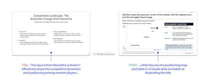
A Beautiful.ai slide listing energy drink brands as bullets beside a Claude slide placing the same brands on a price-versus-image positioning map.

The layout on the left from Beautiful.ai is basic bullets while the layout on the right from Claude is much better suited to show a competitive position.

2. Only relevant data

Just like it's important to choose a layout that communicates the key message, it's also important to clean the slide for any details or info that make it more difficult to grasp the key message. It's fine adding detailed info (in fact, it's encouraged with techniques like the pyramid principle) but having data on the slide that is not directly connected to the main message makes it confusing.

  • Pass: Every element on every slide supports the title's message.
  • Partial: A few slides carry loosely related detail that should be cut or moved to the appendix.
  • Fail: Slides are crowded with information that competes with the main message.


3. Action titles

An action title states the slide's main message as a complete sentence, for example "Revenue grew 12% a year, driven by enterprise segment" rather than "Revenue development". Action titles are a core part of any consulting deliverable and read in sequence, they should tell the whole story. See our post on how to write action titles like McKinsey for reference.

  • Pass: Every content slide has a full-sentence title that states its takeaway, and the body proves it.
  • Partial: Titles are sentences, but some describe the topic rather than the conclusion, or claim more than the body shows.
  • Fail: Titles are topic labels.


4. Consulting tone and depth

Consulting slides are often quite detailed, and the text carries a point of view or conclusion on whatever the slide shows. AI text tends towards fluff; correct, general and safe.

  • Pass: Text is specific (numbers, names, causes) and states a conclusion.
  • Partial: The right level of detail, but neutral or descriptive in tone.
  • Fail: Generic statements that could appear in any deck on the topic.


The deck

5. Visual balance

This is one of the most important aspects of a consulting deck and what helps lift the outputs from fine to great. The mix of layouts across the deck should be varied and support the arc of the storyline.

  • Pass: Layouts vary with the content with a balanced mix of different types of layout that both suit the content and are interesting in plenum.
  • Partial: Some variation, but a default to same layouts throughout.
  • Fail: A handful of layouts repeated in the deck, especially in sequence.
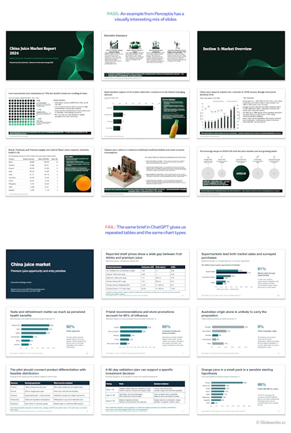
Two slide grids from one brief: a Perceptis deck with varied chart types and illustrations, and a ChatGPT deck repeating bar charts with big-number callouts.

From the same brief, Perceptis varies its layouts across the deck. In ChatGPT’s deck, five of the eight content slides are a bar chart with a big-number callout, and the other three are tables.

6. Storyline structure

Storylining is a key part of what makes consulting decks good. Different types of deck follow different storylines, and the audience and setting change the structure again. A business case for a steering committee is not built like a market study for a strategy team.

  • Pass: The structure fits the deck type and audience, and the executive summary matches the body.
  • Partial: A sensible structure, but a generic one, or with a section out of order.
  • Fail: A list of topics rather than an argument.


7. Coherent messages and numbers

Messages and numbers must agree across the whole deck. A figure on slide 3 should match the same figure on slide 18, and the conclusion should follow from the evidence.

  • Pass: No contradictions in messages or numbers, and every number traces to the brief or a stated source.
  • Partial: One or two minor inconsistencies, such as rounding or a label mismatch, that does not change a conclusion.
  • Fail: Any number or message that contradicts another, or a number that cannot be traced.


The finish

8. Looks like real consulting work

Setting aside colors and fonts, do the slides look and feel like real McKinsey or BCG slides? This is arguably one of the most subjective criteria and so we try to anchor it both in our own experience and against real decks from McKinsey, Bain, and BCG.

  • Pass: The slides look and feel like real consulting slides with complex layouts, chart-heavy slides, and clear arguments.
  • Partial: The right style, but visibly or informationally lightweight.
  • Fail: The slides read as generic presentation software output.
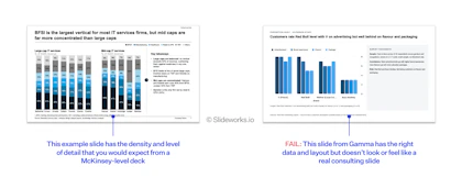
A dense consulting-style slide with annotated stacked column charts and key takeaways, beside a sparse Gamma slide with a plain grouped bar chart.

The example slide carries the density and annotation of a McKinsey-level deck. Gamma’s slide has the right data and layout but reads as generic presentation software.

9. Follows the brand

An important part of any slide workflow is to be able to follow a certain slide master and brand guidelines. A deck that requires a recoloring and rebranding compared to the requirements won’t fly, however good its content.

  • Pass: The output uses the master's layouts, fonts, colors and placeholders and the master carries over into the output to be easily changed.
  • Partial: Colors and fonts are applied, but positions, sizes or placeholders drift from the master OR the master does not carry over into the output and each slide is linked to a generic slide master.
  • Fail: The master is ignored or cannot be supplied.


10. Client-ready

Would we send this deck to a client? This is the verdict, explained in the next section.

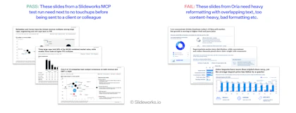
Pass example: three clean IT services slides from a Slideworks MCP test run. Fail example: three Oria slides on China’s juice market with overlapping labels.

The passing slides come from a test run of Slideworks MCP, our own tool, and need only a proofread. Oria’s slides need heavy reformatting before anyone outside the team sees them.

How the scores become a verdict

Each of criteria 1 to 9 gets one of three marks: pass, partial or fail. We use three levels rather than a 1-to-10 scale on purpose so there is no false precision.

The verdict, criterion 10, follows three rules:

  1. Client-ready means the deck could go to a client after a final proofread. That requires no fails and at most one or two partials.
  2. Client-ready after editing means the structure and content are sound, but slides need rework. We state our estimate of the editing time, for example "about 3 hours".
  3. Not client-ready means fixing the deck would take about as long as building it.

In every review, the verdict appears first, followed by the nine marks. In comparisons, we total the passes and partials (pass = 2, partial = 1, fail = 0, out of 18) so tools can be sorted.

What we report next to the score

Price and speed matter to anyone choosing a tool, but they are not measures of quality. A cheap tool that produces a mediocre deck is still a mediocre deck. We therefore report four facts next to every score and never fold them into it.

Fact What we record
Price Monthly price of the plan we tested, and the cheapest plan that can produce the same output
Time to first draft Minutes from submitting the brief to a complete first version
Output format Native editable PowerPoint, image-based export, or web only; whether charts are native and editable

What this method does not measure

This method is one we developed internally to test and judge new AI slide tools. Like any other test method, it’s not able to cover every aspect. These are the limits we know about:

  • It’s our own judgement: The pass, partial and fail lines make the judgement consistent and open to challenge, not objective. We publish the outputs and recordings so readers can check our calls.
  • It's based on consulting standards: Linked to the previous bullet, then our judgement is based on consulting slides. Our tests are not relevant if you're evaluating slide tools for image-heavy sales pitches or graphical funding decks. We focus solely on the consulting/business sphere.
  • It’s a snapshot: AI tools change every few weeks. Every score carries its test date, and we re-test when a tool releases a major update.
  • It measures the output, not the experience: Ease of use, security and enterprise features matter, but they are outside this method. Where they matter for a decision, we cover them separately in the review.
  • It tests our briefs: A tool may perform better or worse on decks unlike ours. We use common consulting briefs to keep the test relevant to our readers.

Version history

Version Date Change
1.0 Oct 16 2026 First published version. Reviews before this date used earlier criteria and say so.

Frequently asked questions (FAQs)

Q: What makes a slide consulting-grade?

A:

A consulting-grade slide makes one point, states it in a full-sentence action title, uses the layout that best proves it, and carries nothing that distracts from it.

Q: Can AI make consulting-grade slides?

A:

In our tests so far, AI tools often pass slide-level criteria such as action titles but fail deck-level criteria such as visual balance and coherent numbers. None of the outputs are client-ready without editing. See our latest test results.

Q: Why is cost not part of the score?

A:

Cost is not a measure of quality. We report it next to the score so readers can weigh it against their own budget.

Q: How do you tell an AI-generated deck from a consulting deck?

A:

Look at the deck as a whole. AI decks tend to repeat the same layouts, describe topics rather than state conclusions, and contain numbers that do not agree from slide to slide.

Q: Can I use these criteria to check my own deck?

A:

Yes, and we encourage you too. Take the list and adapt it to the standards that are important in your company or team.