Even though it’s 2026 and AI is changing the way we work, creating great and impactful presentations is as much craftsmanship as it is prompts and data. And like any craft, one of the best ways to learn is to study good examples.
In this article, we’ve rounded up over 750 different consulting decks from the top players in the game and highlighted some of their best publicly available work.
What makes consulting presentations different?
Consulting presentations are known for their structured storytelling, clear messages, and fondness for data-heavy slides.
Great consulting presentations are able to take complex topics and weeks or months of analysis and distill them into convincing narratives that are backed up by extensive data and often tens or hundreds of slides, yet whose main points and takeaways are easily understood and retold.
Consulting presentations serve very specific purposes within corporate environments. They are supposed to communicate large amounts of data, complex insights, and strategic recommendations in a way that can often both be presented and shared for later reading. They are often quite important and serious documents whose recommendations affect people’s work tasks, roles, and sometimes job security.
Therefore, consulting-style presentations are purposefully not very artsy or colorful as this would detract from the main messages being conveyed.
McKinsey presentations
McKinsey is undoubtedly one of the most prestigious firms in the consulting industry and lauded for their ability to communicate compellingly through slides. They are known for their black-and-blue formatting and professional, strict slide structure.
Three great McKinsey presentations
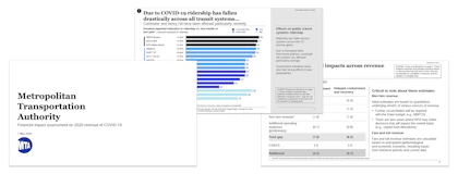
McKinsey example 1: MTA: Financial Impact Assessment on 2020 Revenue of COVID-19 (2020)
This deck is a great example of how to communicate financial modeling in a way that is both easy to understand and shows the conclusions.
For 100+ more McKinsey decks, see our full list of McKinsey presentations here. The list is divided into client project decks, industry reports and market overviews, McKinsey Global Institute reports, and some miscellaneous interesting decks.
BCG presentations
BCG (or Boston Consulting Group) joins McKinsey in the upper echelons of consulting. Like McKinsey, they stick to a relatively strict slide structure with little use of colors. Their main colors are shades of green, complemented by bright blue, red, and yellow for highlighting. In the mid 2010s, BCG switched to a “T-model” of storytelling, where the main story points could be told in simpler slides (the crossbar of the “T”), which were backed up by detailed hidden slides which could be opened if needed (the body of the “T”).
Three great BCG presentations
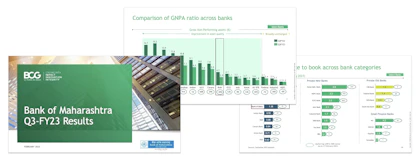
BCG example 1: Bank of Maharashtra: Q3-FY23 Results (2023)
This deck expertly showcases how to benchmark performance in different types of charts.
See the rest of the more than 100 BCG decks in our article here. The list is divided into client projects, proposals, case and student materials, and industry reports.
Bain presentations
Along with McKinsey and BCG, Bain rounds out the top-tier of consulting, otherwise known as “MBB”. Bain follows and equally stringent set of rules for slide design, sticking to a red-and-black palette that effectively uses colors to highlight main messages and key takeaways.
Three great Bain presentations
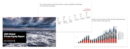
Bain example 1: 2023 Global Private Equity Report (2023)
This short, data-heavy deck gives a summary of the global private equity market. It does a great job of showing how to present data in a way that is neither monotonous or confusing, including how to use color to highlight the point of a slide.
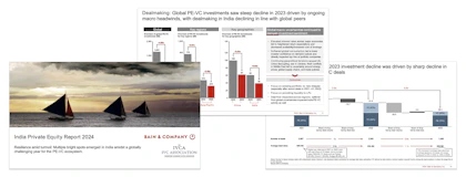
Bain example 2: India Private Equity Report 2024 (2024)
Here is a second example of a report on the private equity market, but in a version that is meant to be read and not necessarily presented. The 55-page deck shows how to structure dense, text- and data-heavy slides while still keeping the main points clear and not becoming walls of text.
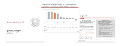
Bain example 3: Syracuse University Diagnostic report (2014)
This older deck focuses on assessing the current financial situation of the client, benchmarking with peers, and identifying areas of inefficiencies. Although not quite modern in its formatting, it does a great job of showing how to condense complex areas into one-pagers so it becomes digestible yet information-rich.
See the full list of 55+ Bain presentations in our article here.
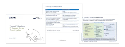
Deloitte presentations
Deloitte is one of the largest and most respected consulting firms in the world and part of the Big Four. They do a wide range of projects from more accounting-focused to implementation to strategy. Here are three great decks from Deloitte and the rest in a list below.
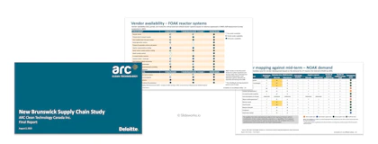
Deloitte example 1: New Brunswick Supply Chain Study: Final Report (2023)
This 70 page report details the commercial readiness and supply chain resilience of New Brunswick's energy grid. A great example of scoring frameworks used in different ways, as well as vendor evaluation.
How to build your own consulting-style presentation
To build presentations like a management consultant you can follow a few guidelines:
- Overall storyline is the key to a good presentation:
Storyline refers to the overall narrative and flow of the deck, both which sections you include when and how the individual slides fit together.
Without a good storyline your main points will not be effectively communicated or worse case completely lost.
Spend upfront, dedicated time to examining the storyline before you jump into creating each slide. One way is to sketch out your overall flow on paper and/or to only include the titles of all slides and read through them.
- Use action titles to guide your audience:
Action titles mean slide titles that state the main conclusion of a slide (e.g., "World economy has recovered since 2020") as opposed to a simple descriptive title (e.g., "World economy overview").
Action titles are a core component of great consulting slides. They support the overall flow of your presentation and allow you to define for your audience what they should be focusing on within each slide. This allows you to steer the direction of the presentation and effectively build up to your recommendations or conclusions.
- Don't reinvent the wheel:
The open secret of good consulting presentations is also that consultants don't reinvent the wheel for every new project and deliverable. Instead, consultants at firms like McKinsey, BCG, and Bain have access to an extensive internal database of past cases. When starting a new case, one of the first steps is often to search the database for similar presentations in terms of subject and industry, and to then build the new final deliverable or presentation using those past cases as the skeleton. This saves an inordinate amount of time and means the best practice structures are repeated and reinforced.
In fact, this approach was one of our original reasons for starting Slideworks. We wanted to create a publicly available library of great slides and real-world cases so professionals could have access to the same time-saving, best practice tools that top-tier consultants use. You can see all our templates within various topics here, or get the full library directly here.
- Consistent and careful formatting:
It may sound trivial, but consistent and careful formatting is a large part of great decks. Consulting decks often stick to simple, understated color schemes and discreet fonts to let the content of the slide stand out. If pictures or graphics are used, these are often to make a specific point or support a text slide on e.g., trends.
Small things like slide title positions, font sizes, spacing, and "no-fly-zones" (the blank space on the sides of a slide) are kept consistent so the audience are not distracted by titles jumping around or large differences between sequential slides.
The attention to detail is both to keep the focus on the subject matter and discretely gives the audience the impression that if the consultants are rigorous with the final deliverable they are equally rigorous with their analyses and everything else that lies behind the final conclusions. In that way, it is a quality stamp of approval.
- Be ruthless:
Finally, creating truly great presentations requires you to be ruthless in regards to which slides you keep and why. Every week or few weeks, take a step back and look at all the slides you have so far in your presentation. Take out any that are not strictly necessary to make the points you're trying to make and keep only the absolutely crucial slides.
Move the rest of the slides to an appendix or backup deck in case you need them at some point (it also makes ruthless cutting easier).
Although it can feel painful taking out slides that you may have spent days on (or even weeks with the underlying analysis) it is one of the best ways to ensure your final presentation will be compelling.
This is similar to many writing exercises where the writer practices writing the same story as long, short, and then long again versions, which ultimately means the final story becomes better, more persuasive, and with less fluff.
Just remember that truly great and effective presentations work to convince the audience of a message and recommendation, and not to showcase how many hours you spent building it. From this point of view, a tight 10-page deck can be 100x better than a 115-page detailed report.